RestaurantDemo · sample project
A restaurant that wins you over before you walk in
A full site demo for hospitality: a digital menu with filters and instant search, online bookings with live validation, and a gallery that looks the part.
- Digital menu
- Online booking
- Masonry gallery
- Framer Motion
- Lazy loading
- Code splitting
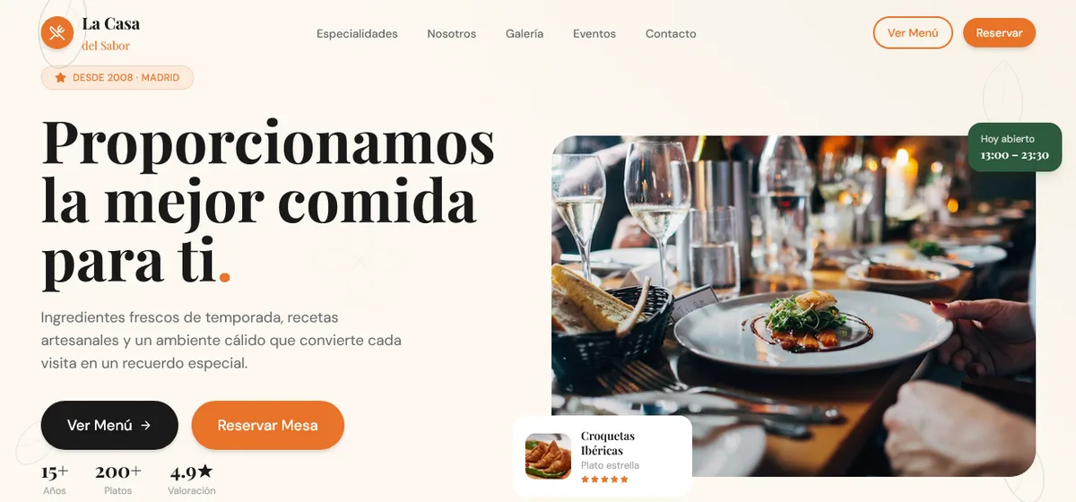
The result
The customer sees the menu, gets hungry and books a table without calling or waiting.
This one is not a client: it is a demo I built to show what a restaurant’s site can look like. It genuinely works on screen, but it is not wired to anybody’s kitchen. The production version gets tailored to each business.
What had to be solved
Almost every small restaurant shows its menu as a photo or a PDF. On a phone that reads badly: you have to zoom, drag and guess the price. And the booking usually ends in a phone call nobody picks up in the middle of service.
A restaurant sells on two things: what you eat and how it feels to be there. The site had to do both.
What I built
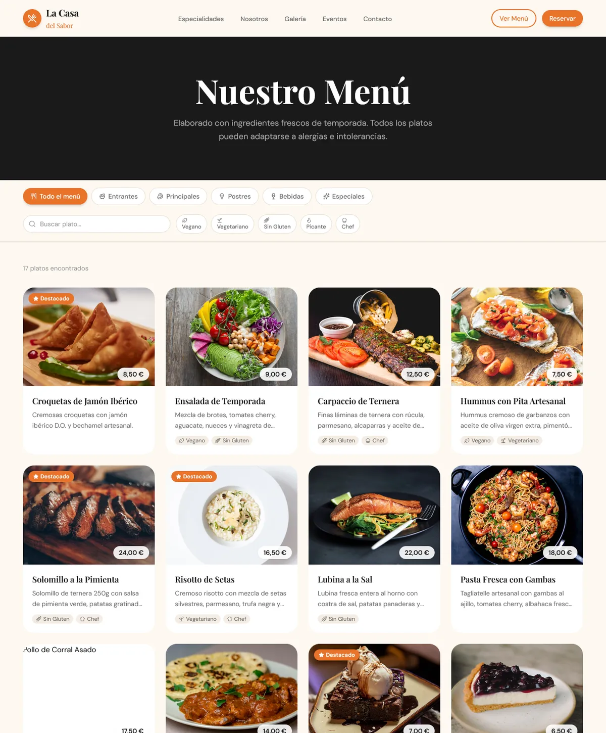
- A digital menu with category filters —starters, mains, desserts, drinks and specials— and instant search by dish name.
- Dietary filters: vegan, vegetarian, gluten-free, spicy and chef’s pick. Someone who cannot eat gluten sees their menu in one tap, without scrolling the whole thing or asking.
- A live counter of dishes found, so you can tell the filter is actually doing something.
- A booking system with live validation: mistakes are flagged as you type, not after you hit send.
- A masonry gallery with careful transitions, so the food looks the way it looks on the table.
- Entrance animations on every section with Framer Motion, magazine-paced and never dizzying.
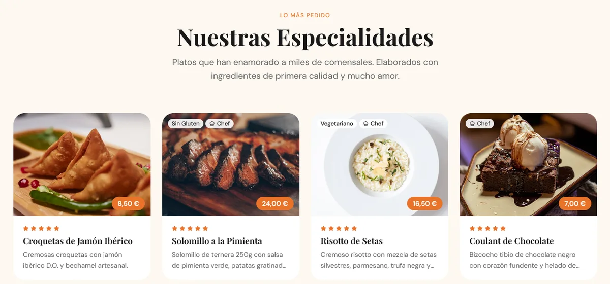
- Full dish cards: photo, description, price, rating and tags like featured, vegetarian, gluten-free or chef’s pick.
- Events and testimonials sections, with the average rating up front.
- Contact with hours, address and a direct link to Maps, for whoever already decided to go.
- Very fast loading, with lazy loading and code splitting: someone looking for dinner decides in seconds, standing on the street.
- Genuinely responsive on phone, tablet and desktop.
Where you notice it
The customer walks in, sees what there is to eat, feels what the place is like, and books. All on the same page and without talking to anyone. The kitchen stops getting interrupted to answer the phone.
It works as-is for any hospitality business: restaurant, café, bar or catering. Swap the menu, the photos and the branding, and that is it.